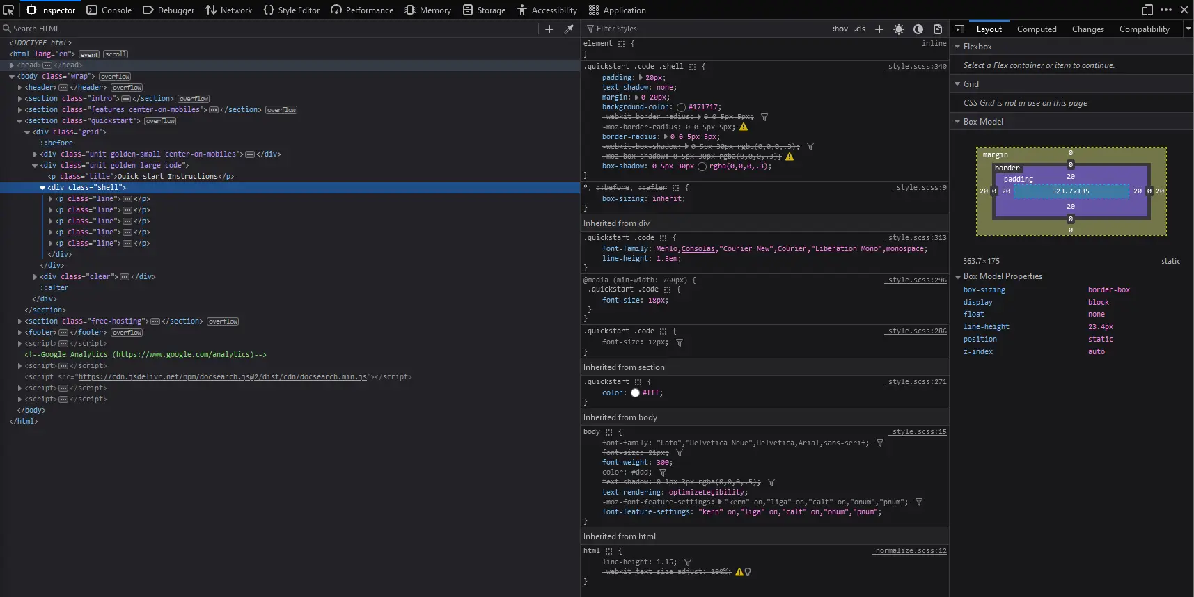
Quick Start Instructions UI
UI Item - Summary
I think the floating box over the maroon bar stands out and draws you in.
UI Item - Techniques
They used several different CSS Techniques on this element. They have padding, text shadows, margin, background color, border radius, box shadow, and they use float as well as display: block. The whole quickstart section is made up of several elements, grid, unit golden small and large, then the shell.