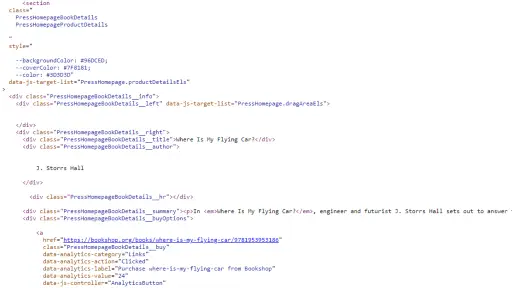
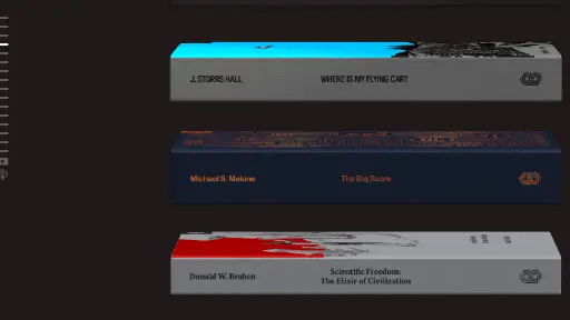
I thought the site Navigation was kindof neat on the left side of the page. As you pass through there are hover effects and they used buttons instead of anchors. They used class naming to prefix everything with "PressHomepage" to avoid naming conflicts. On the buttons they are using data attributes. Which I believe means they're tracking user interactions. Which is probably to gather data on how people use their site.

Stripe Press's user interface is clean and focused on showcasing their books. They use a dark background that makes their book spines pop out on the screen. The navigation is either done on the left side of the screen with small lines or scrolling and clicking on each book. When you click on a book, it smoothly slides into view with all the details. Each book has its own colors which show up when you click on them. Each books details and links to purchase pop up then as well.

Browsing Strip Press is similar to exploring a library. They way you can scroll through their book collection side by side reminds me of walking past bookshelves. Then you find one and click it is like pulling a book off the shelf to read the back and get some details. It's simple to browse through their collection while not overpowering with flashy effects.

Summary
I think Strip Press's website is put together well. They built a cool way to find books. With the whole site being dark it makes the colorful books really stand out. Its a short walk through a digital library that feels almost like browsing through a real library.