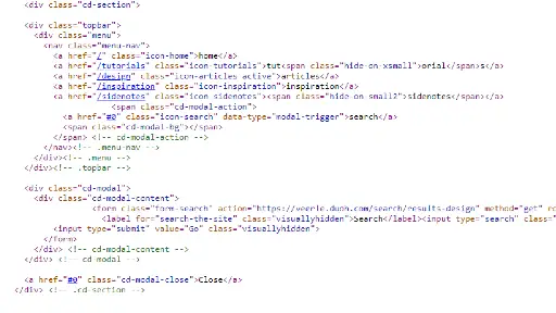
Code ✹ ✹ ✹ ✹ ✹
I found the navigation interesting. When you're on smaller screens
Tutorial converts to Tut while Inspiration and Sidenotes convert
to just their Icons leaving only Articles as a full word. Looks
like they did it with
<a href="/tutorials" class="icon-tutorials">tut<span
                class="hide-on-xsmall">orial</span>s</a>
Using a class to remove "orial" on smaller screens. Saving space
to condense the navbar instead of using a hamburger menu.
UI ✹ ✹ ✹ ✹ ✹
The UI on Veerle is smooth. Each content section has a distinct visual header with custom icons which helps separate everything in an obvious but appealing way. She uses a responsive grid throughout the site and navigation is easy to use across different screen sizes. There are obvious calls to action across the site.
UX ✹ ✹ ✹ ✹ ✹
I would describe the UX of this site as evoking a sense of calm curiosity. You're guided gently through different content categories without feeling overwhelmed. Each article preview gives you just enough information to spark some interest to click the continue button. It was a fun exploration.

Summary
Veerle's site is smart in how it works - like how the menu shrinks text instead of using a hamburger menu. Everything looks clean and organized with nice icons showing you where different things are. Best of all, browsing through the site feels relaxing and makes you want to explore more. It's a good example of a website that works well and feels nice to use.